

The Team

Saachi Shah
Information Design ‘25

Rethanyaa Prabakar
Information Design ‘25

Vijeesh AV
Design for Retail Experience ‘25

Nisheeth Ranjan Shrivastava
Information Design ‘25

Swapnesh Samaiya
Guide
Overview
A New Wayfinding System
As part of the 20-year anniversary celebrations at National Institute of Design Bangalore, this project focused on improving the campus wayfinding experience through a collaborative and research-led approach.
The aim was to create a navigation system that feels intuitive, accessible, and reflective of the campus identity. The project involved understanding movement patterns, identifying gaps in the existing system, and designing a cohesive wayfinding language for students, faculty, staff, and visitors.
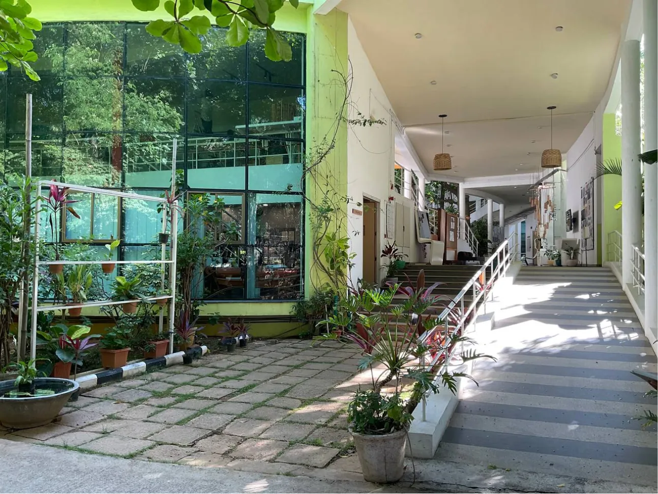
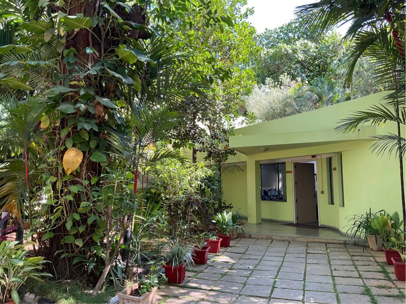
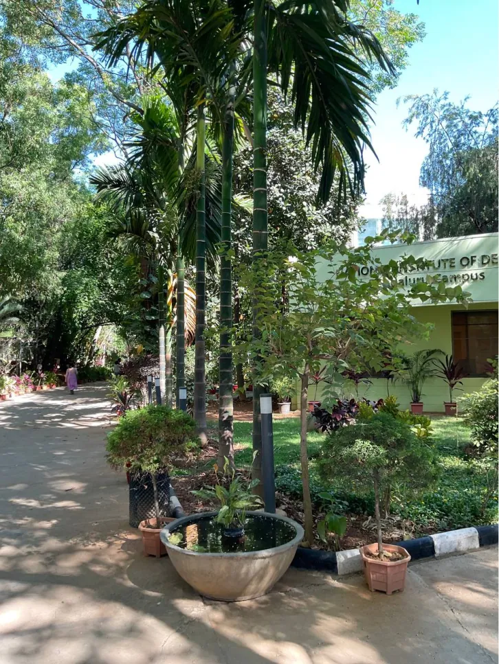
Context of the space
Due to the organic growth of the campus over the years, navigation often became confusing for first-time visitors.
We looked at the campus not just as a physical environment, but as a lived and evolving space with diverse users and movement behaviours.
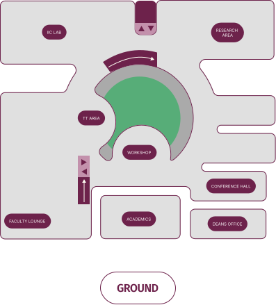
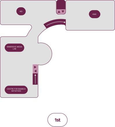
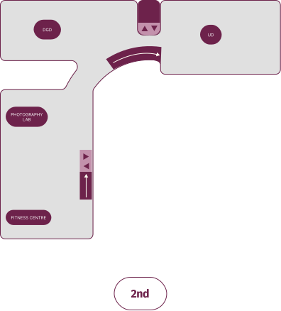
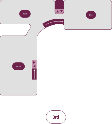
Floor Plans of the building
A Spatial Audit
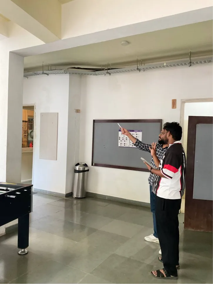
A detailed spatial audit was conducted to understand navigation challenges across the campus. This included documenting pathways, landmarks, key decision points, and existing signages.
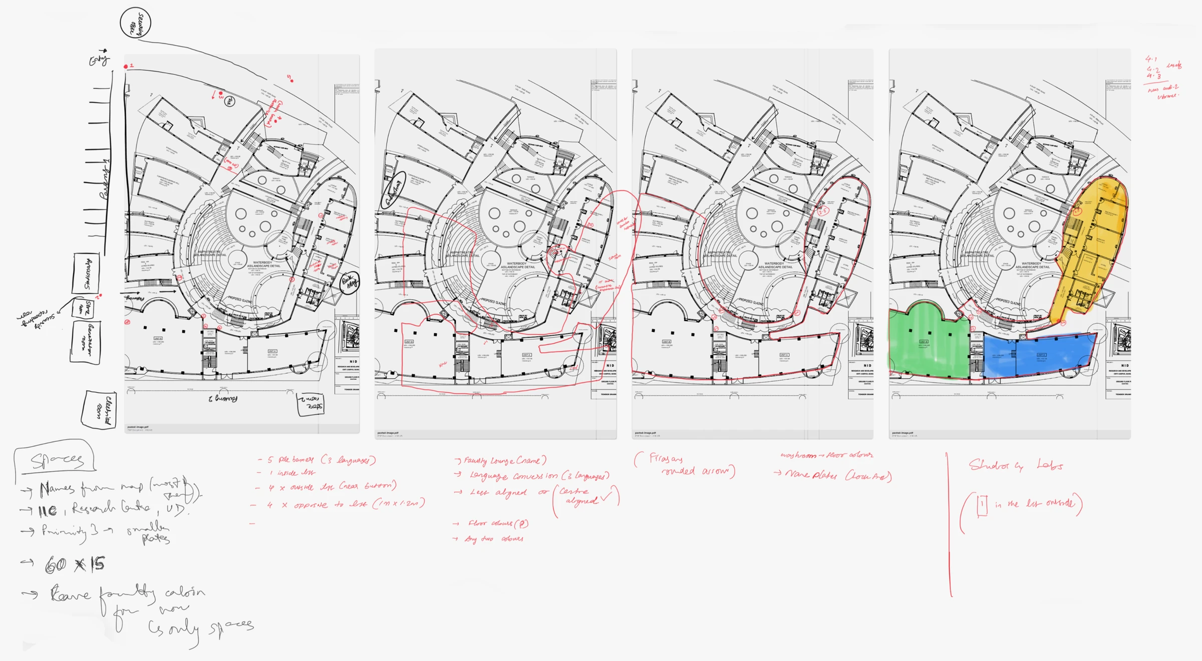
Expected User Experience and Decisions Around It
The system aimed to establish consistency across navigation touchpoints while remaining adaptable to different spaces of the campus. Hierarchies of information, placement strategies, and directional cues were developed to simplify movement and reduce cognitive load.
Pain Points

Poor legibility of text

Inconsistent visual design

Poor positioning of the boards

Multiple connecting points, entry and exit points

Different names given to spaces across the years

Difficulty in finding spaces

Difficulty in accessing basic facilities

Poor material used for boards
System Derived
The Visuals
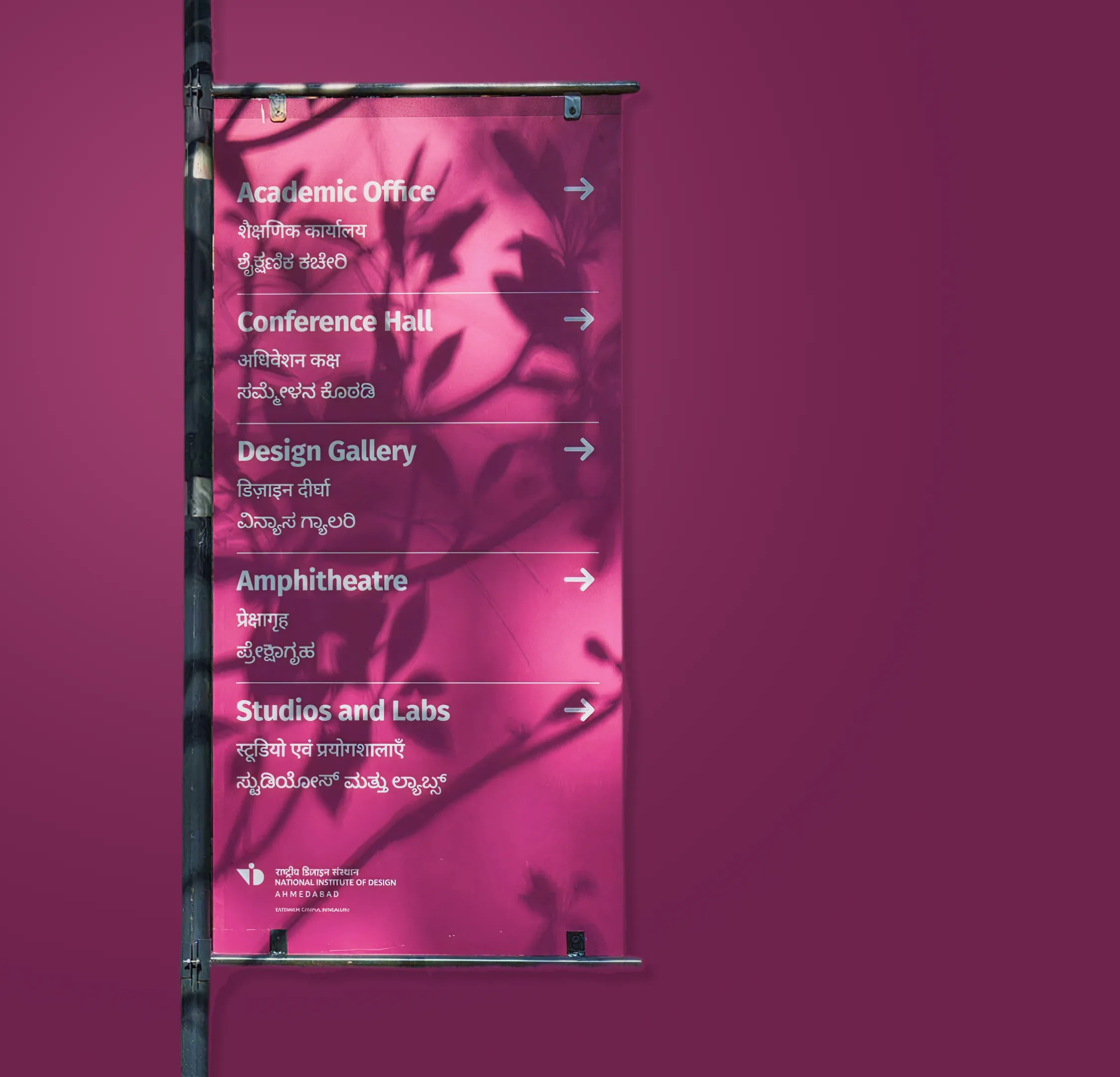
The system aimed to establish consistency across navigation touchpoints while remaining adaptable to different spaces of the campus. Hierarchies of information, placement strategies, and directional cues were developed to simplify movement and reduce cognitive load.
Typography
Fira Sans
Fira Sans was chosen for its high readability, clean structure, and versatile design, making it suitable for a wayfinding system. Its open letterforms and balanced spacing ensure clarity across different viewing distances and signage sizes.
ABCDEFGHIJKLMNOPQRSTUVWXYZ
abcdefghijklmnopqrstuvwxyz
0123456789
Hindi
अ आ इ ई उ ऊ ऋ ए ऐ ओ औ अं अः
क ख ग घ ङ
च छ ज झ ञ
ट ठ ड ढ ण
त थ द ध न
प फ ब भ म
य र ल व
श ष स ह
क्ष त्र ज्ञ श्र
Kannada
ಅ ಆ ಇ ಈ ಉ ಊ ಋ ೠ ಎ ಏ ಐ ಒ ಓ ಔ ಅಂ ಅಃ
ಕ ಖ ಗ ಘ ಙ
ಚ ಛ ಜ ಝ ಞ
ಟ ಠ ಡ ಢ ಣ
ತ ಥ ದ ಧ ನ
ಪ ಫ ಬ ಭ ಮ
ಯ ರ ಲ ವ ಶ ಷ ಸ ಹ
ಳ ಕ್ಷ ಜ್ಞ ಱ ಶ್ರೀ
Colours
Drawing from the natural purplish-red tones of Badaam leaves which is a distinct and familiar element of the campus landscape, helped the wayfinding system feel rooted within its environment while giving it a recognisable and contextual visual identity. The decision of the particular shade was also made on the basis of other colours found in the space.

Icons and Signage
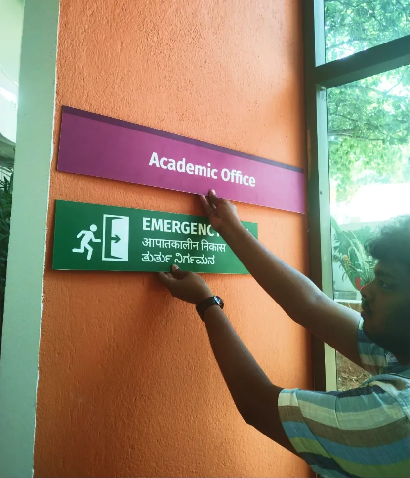
The wayfinding icons were designed using standard universally recognizable forms to ensure quick understanding and effortless navigation. Their simplified and consistent visual style helps the system feel intuitive, cohesive, and well integrated within the campus environment.






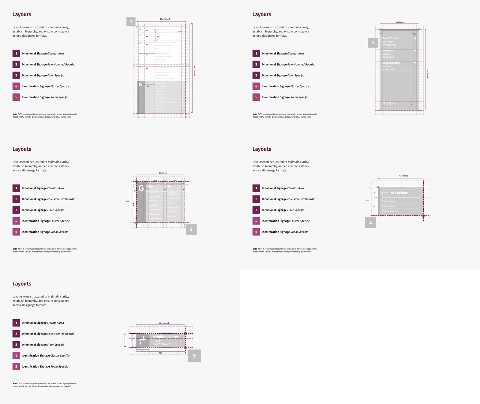
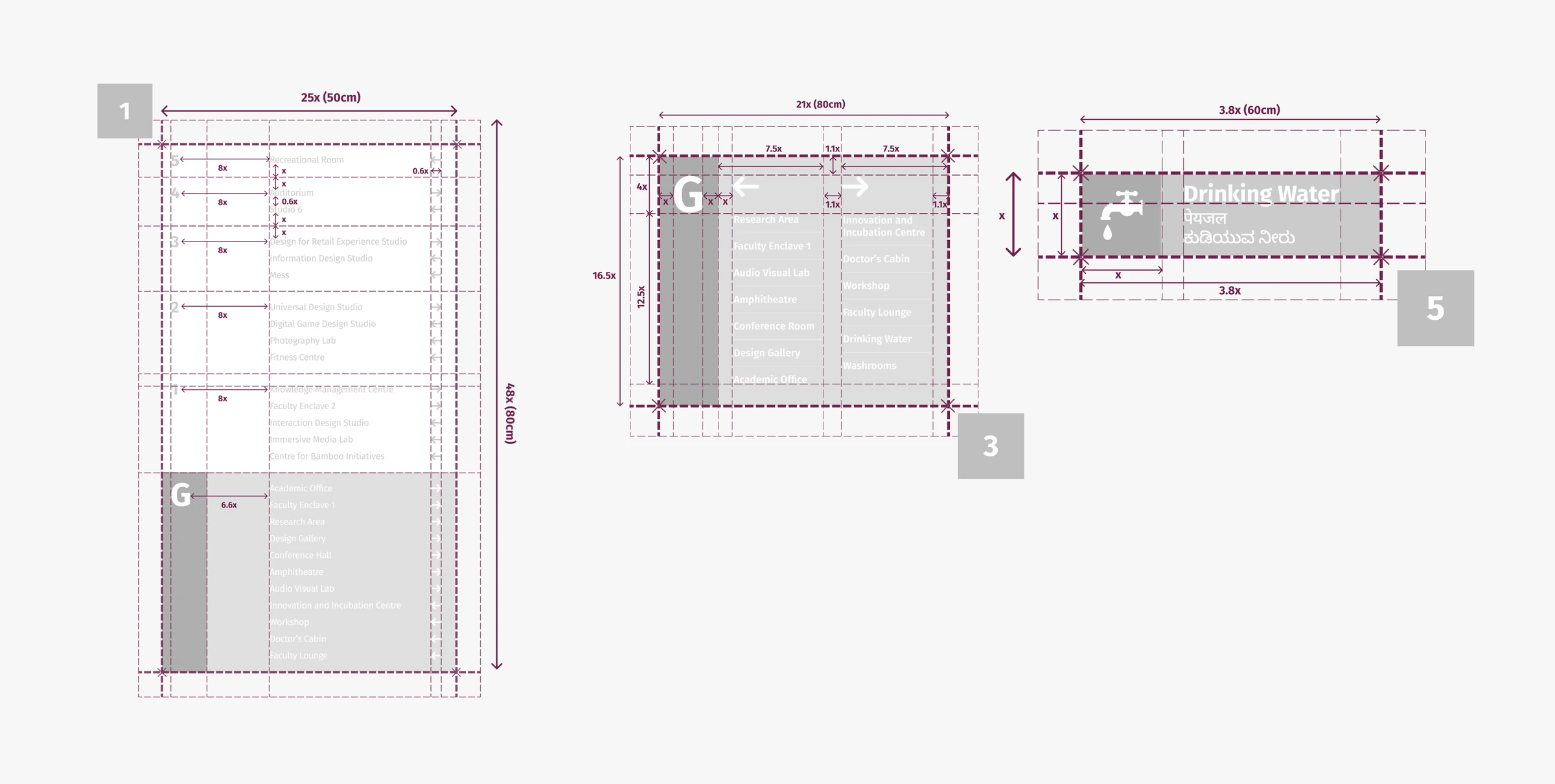
Technical Considerations
The system aimed to create consistent yet adaptable navigation across campus. Clear hierarchies, placement strategies, and directional cues were designed to simplify movement and reduce cognitive load.
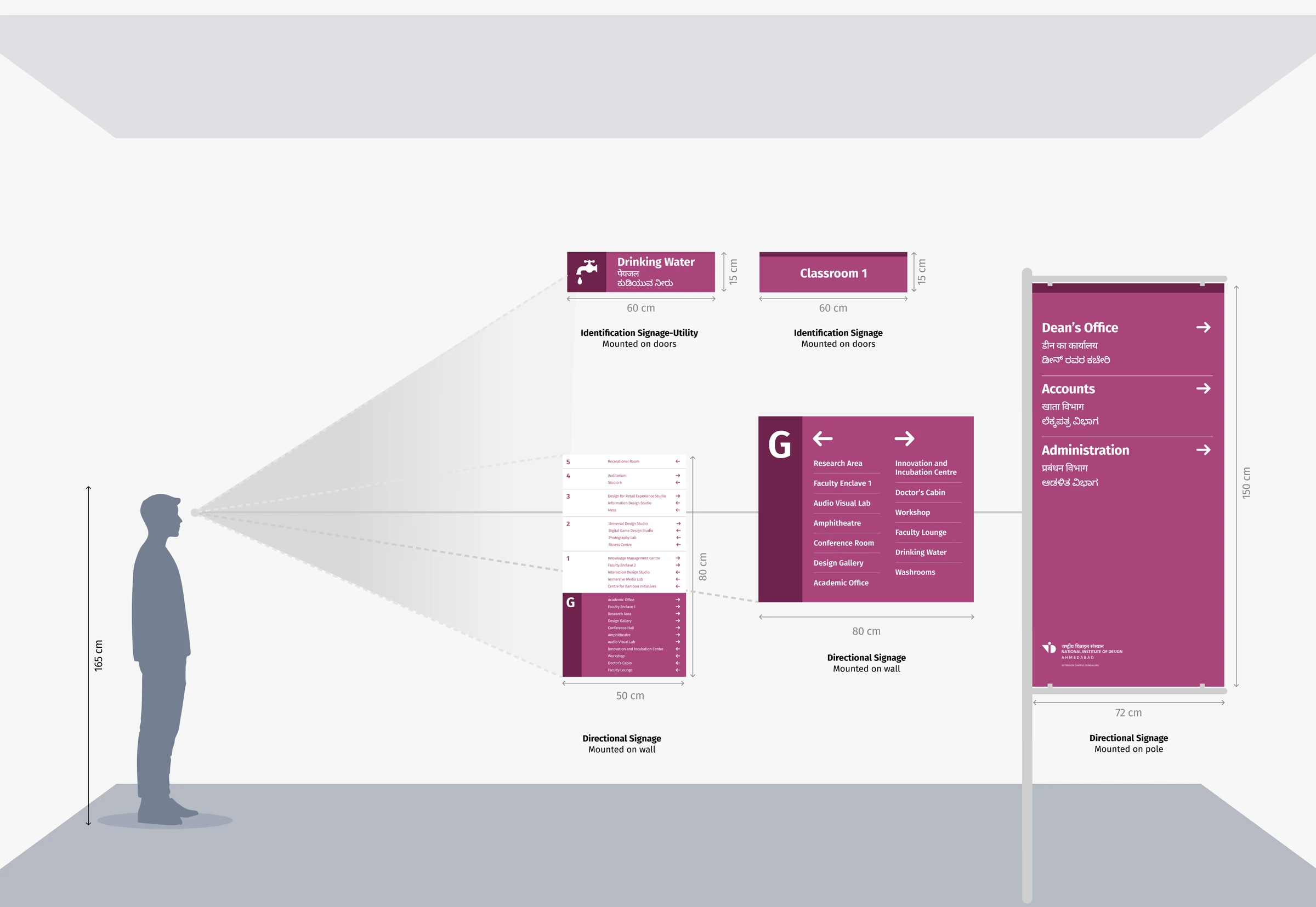
Installations
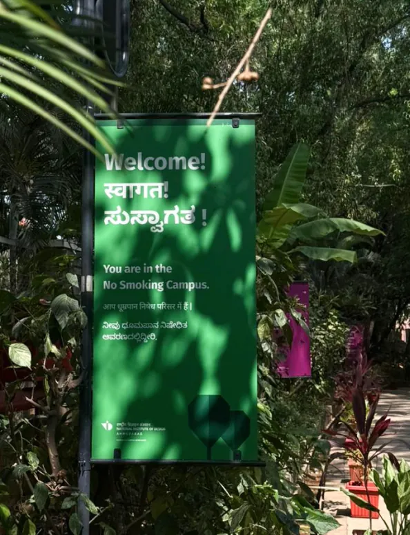
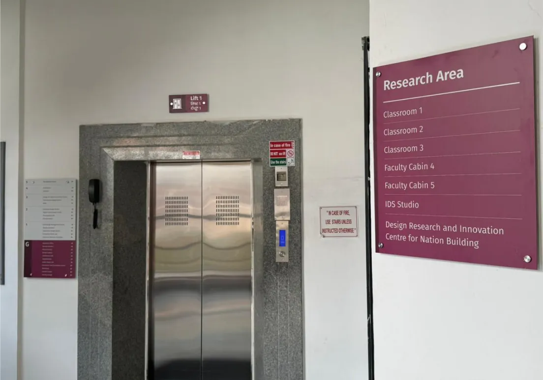
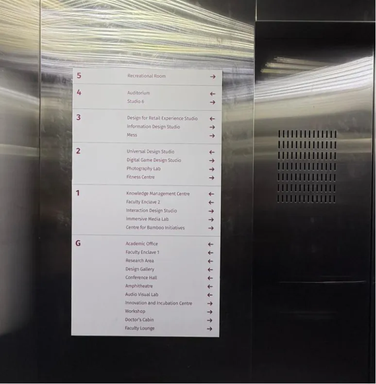
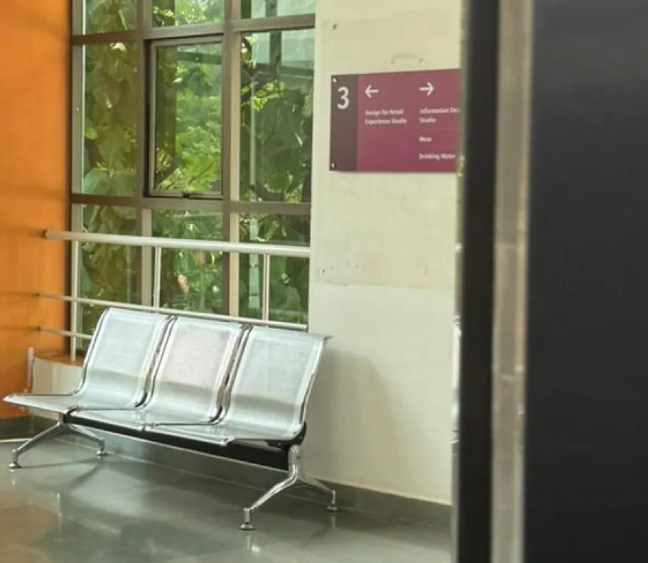
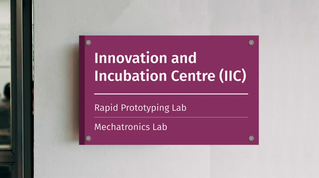
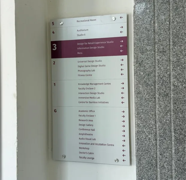
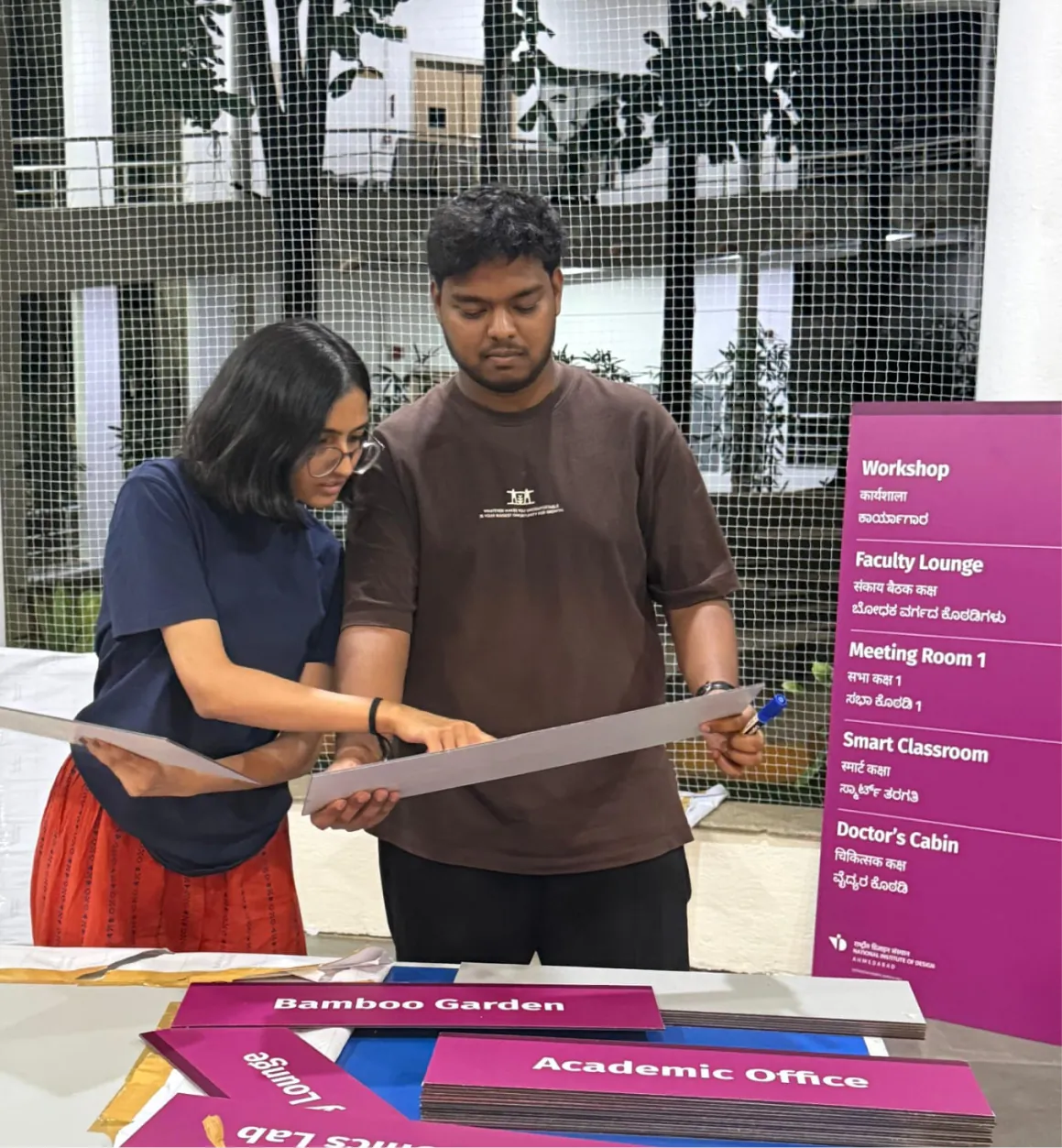
Behind the Scenes

Segregation
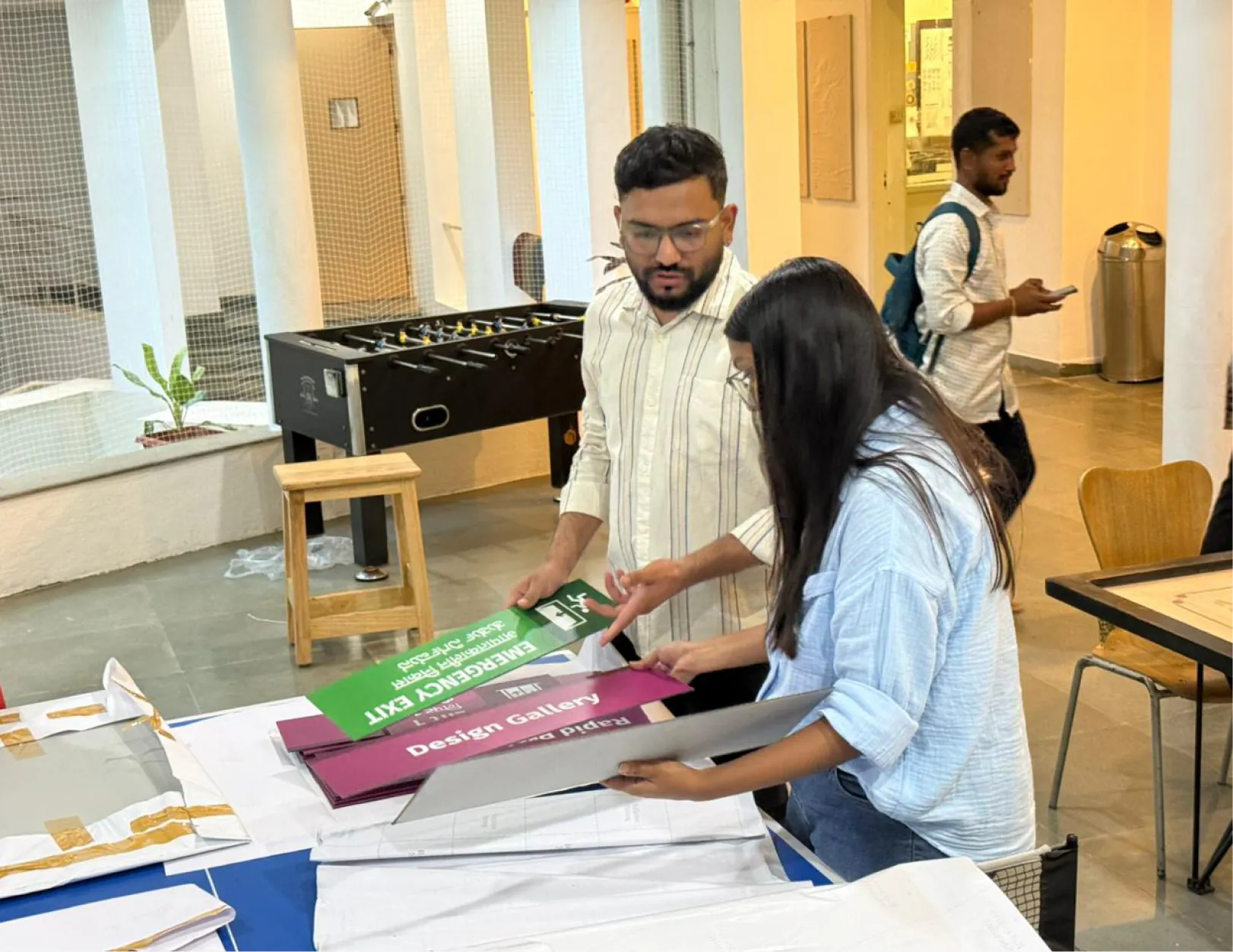
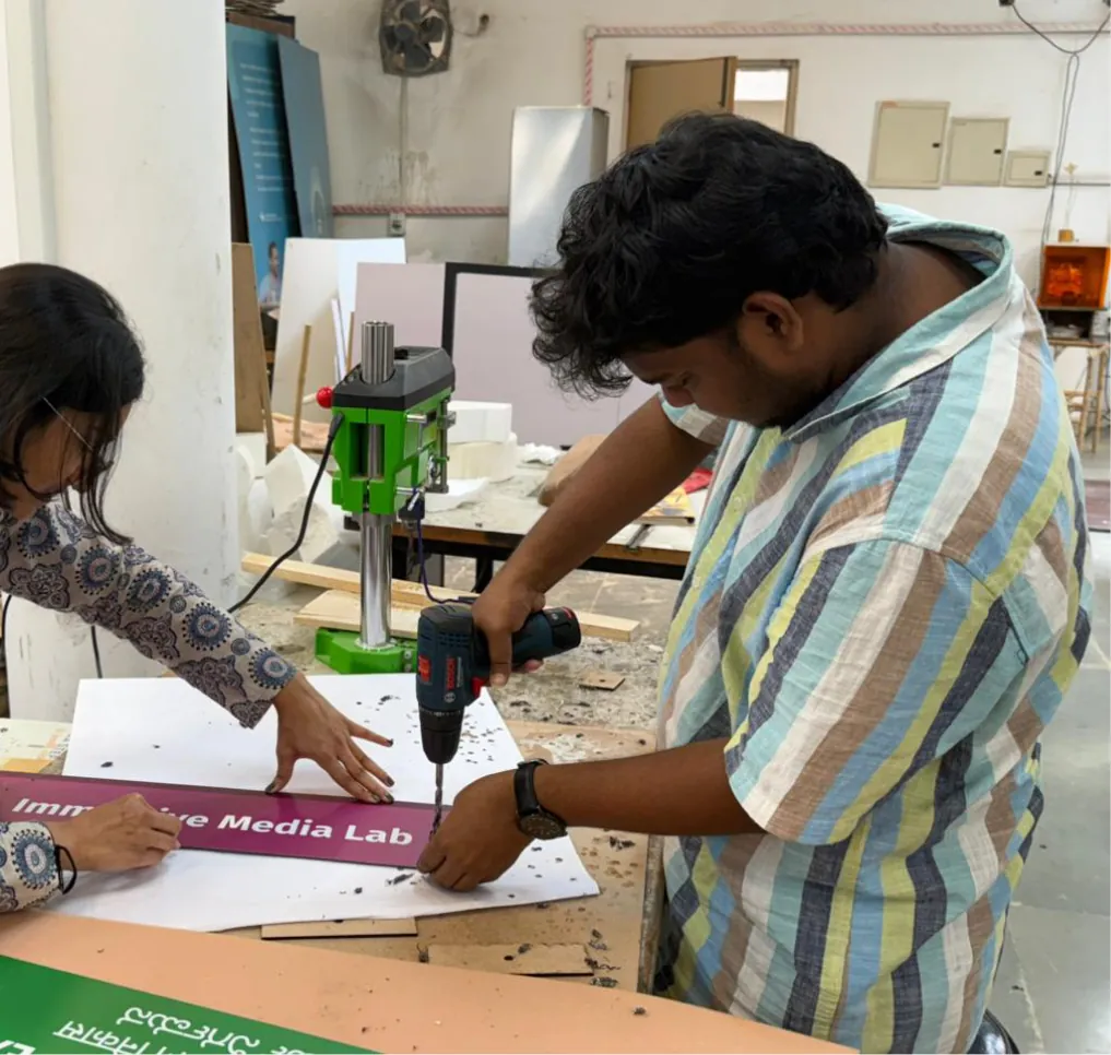
Preparing for installation